Trying to understand the relationship between pressure zones in a water distribution system, I had to quickly learn fairly complex systems. I realized that drawing a profile of the system was a great way to understand the connectivity of pressure zones once you worked on systems with more than two or three zones.
My first step was to draw a system profile like the figure below. It is to scale vertically but only shows the essential facilities and pressure zone boundaries. The key inputs are the elevation of pumps, and control valves and the top and bottom elevations of tanks. Each element should be labelled as well.
You would think that everyone should have this sort of view of their system, but many don’t. I remember walking into one organization and suggesting they draw one. They scoffed at the idea because their system was “so complicated.” We put one together anyway and it ended up on the wall in their control room once they realized how valuable it could be.
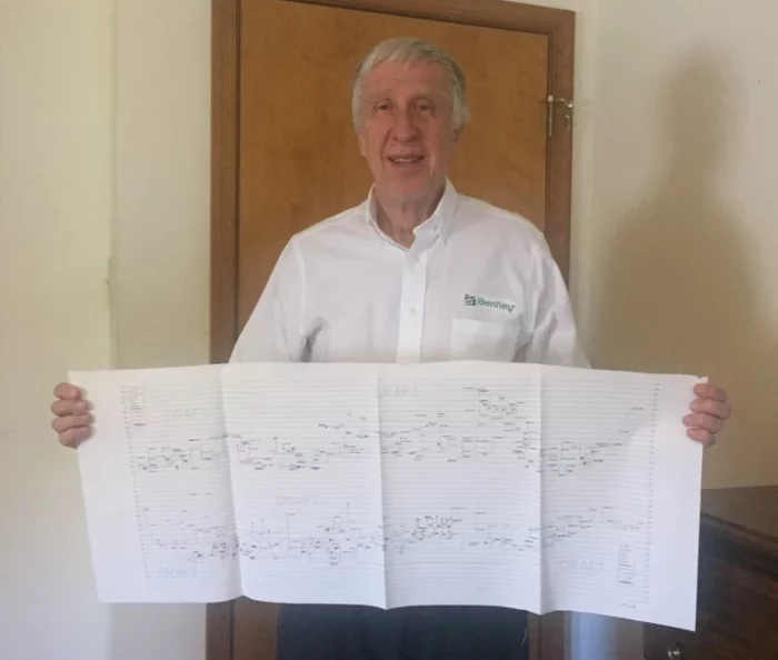
The most complex profile I ever worked with was the Wilkes-Barre/Scranton (PA) system for Pennsylvania American Water. When I started working as engineering manager for the system, I wanted to do a profile. I was told it was impossible. The system had 104 pressure zones at the time. They get water from reservoirs in the surrounding mountains and feed them into the valley through PRVs. Building the profile was not easy, but my technician, Mike Martinez, and I persevered. We ended up with the profile that the handsome fashion model below is holding.
There are actually two parts to the profile. The top starts at the south end of the system and heads up to the middle. The bottom then picks up the profile to the north end. If it was all one profile, it would be eight feet long.
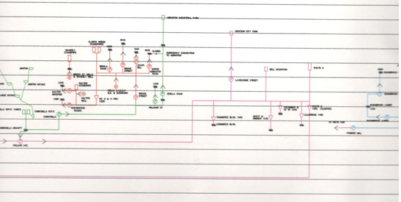
Here is a little snippet of the profile.
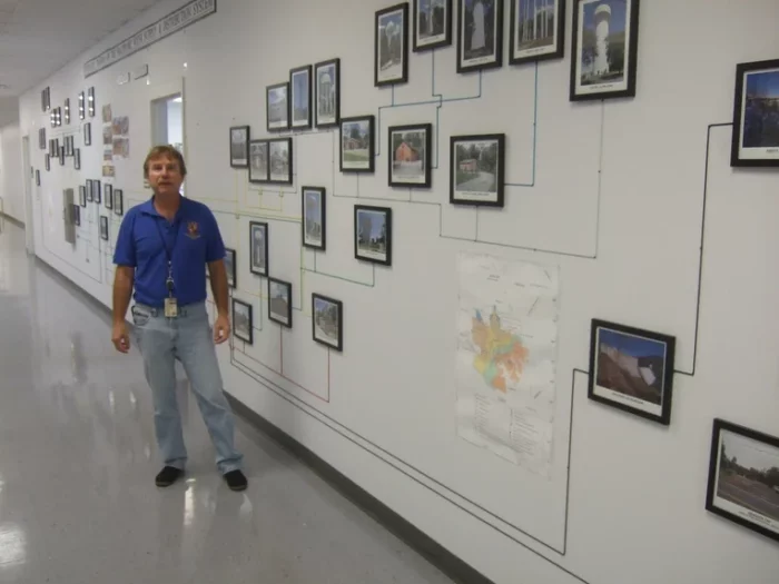
The profiles have some educational value and aren’t just something to do for fun. Some water distribution systems have come up with clever ways to display their profile. Below is a shot of Dale Walker from Baltimore (another handsome guy). Their profile is in the main hall of their building and incorporates photos of key facilities.
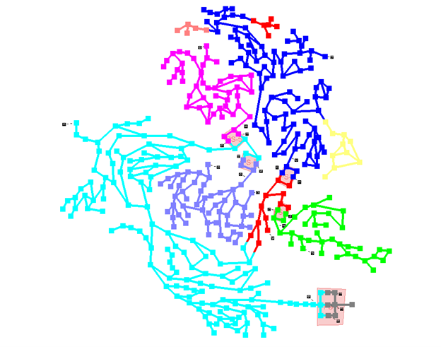
Of course, having a profile of your pressure zones doesn’t mean that it replaces a plan view of your system in your hydraulic model. Here’s an example using OpenFlows WaterGEMS to create a color-coded map from a well-known benchmark model.
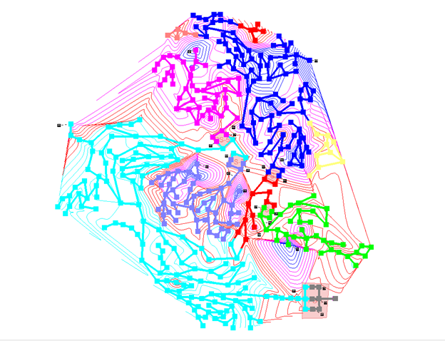
Pressure zones are based on elevation in most cases. In OpenFlows WaterGEMS, it’s possible to overlay elevation contours on the model pressure zones to see the relationship. Note the cyan contours correspond to the low cyan pressure zone while the blue contours correspond to the high blue pressure zone.
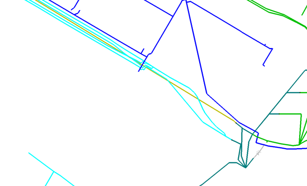
Color coding by pressure zone can give you some great insights into the system. Here’s a case where there are 5 pipes in one street going to 3 different pressure zones.
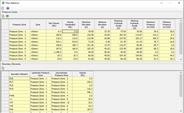
If you prefer tabular output, you can get that as well. These tables summarize the hydraulic properties of each zone and lists the boundary elements connecting zones.
Pressure zones are important but can be difficult to understand. OpenFlow WaterGEMS and OpenFlows WaterCAD makes creating and managing pressure zones easy.
Want to learn more from our resident water and wastewater expert? Join the Dr. Tom Walski Newsletter today!

